Surf Recovery App
1.Design Challenge
Team Individual project
Project type Application design/ high fidelity prototype
BrainStation UX bootcamp diploma program
Timeline January 2020 - March 2020
As part of a course in UX Design we were challenged to utilize all of the principles we learned to design a prototype of a mobile app as a digital solution to a problem space of our choice
Discovery and Exploration
Primary and Secondary Research
Interviews
Experience Maps
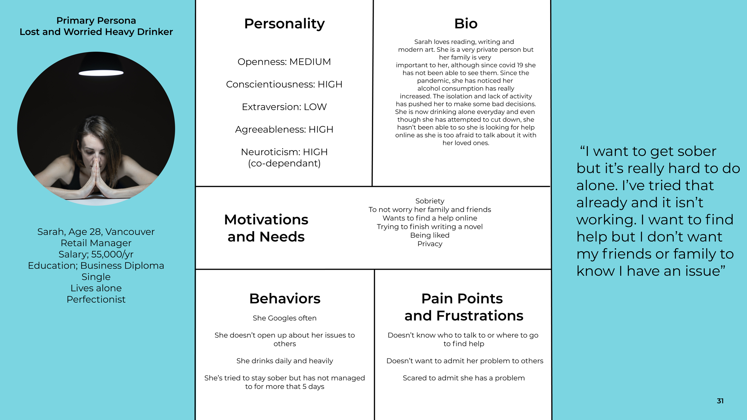
Persona Development
Value and Business Propositions
Sketching
Wireframes
User Tests
Multiple Iterations
High Fidelity Prototype
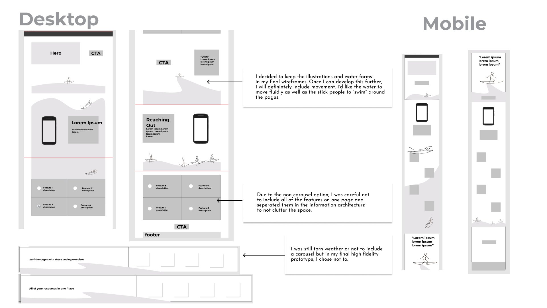
Marketing Site
Keep learning about the users and test often!
Problem Space
Helping those in recovery from addiction
Research
I learned that there exists a real need for a centralized resource for those seeking to stay sober. I also learned that in the abstinence stage of recovery there is a need to learn coping skills
UX Strategy
Test early and test often
Visual Design
The power of words, colour and design could help de-stigmatize and normalize recovery, making it inclusive and accessible to anyone
Brand Strategy
Appeal to a wide variety of users. People from many facets of life choose to live a sober lifestyle. This app is not meant to replace any medicalized treatments that people with serious substance user disorders may need
Development
By demonstrating the positive benefits of my app, I hope I will be able to get funding to bring this project to the next level
2.The Problem Space
The Digital Mental Health Revolution
Secondary Research
Key Findings
E-psychiatry is booming and technology can improve the assessment and interventions on addiction (Frontiers Psychology, 2018)
An increased need for resources in people with substance use problems due to the strain of 2020 (Frontiers Psychology, 2018)
Success in recovery includes identifying internal and external high-risk situations and triggers and then offering behavioural and cognitive interventions to promote the use of new skills and effective coping strategies (review of CBT treatments in substance use disorders, 2017)
Reaching out for help significantly increases the chances of long-term recovery (https://www.ncbi.nlm.nih.gov/pmc/articles/PMC4553654/)
Primary Research
Key Findings
This was by far the most powerful phase of my project. I interviewed 3 people and they were very forthright. They confided in me many heartfelt stories of their experience with addiction and the many tragedies as well as successes they had endured
Success in sobriety is dependent on early access to resources
People are not equipped on their own to manage urges and cravings in early recovery
Traditional programs (A.A) are not sought after among a younger population
How might we equip someone in the early stages of recovery with the skills to overcome urges and cravings and, conjointly, connect them with the right resources in order to prevent relapse?
3.UX
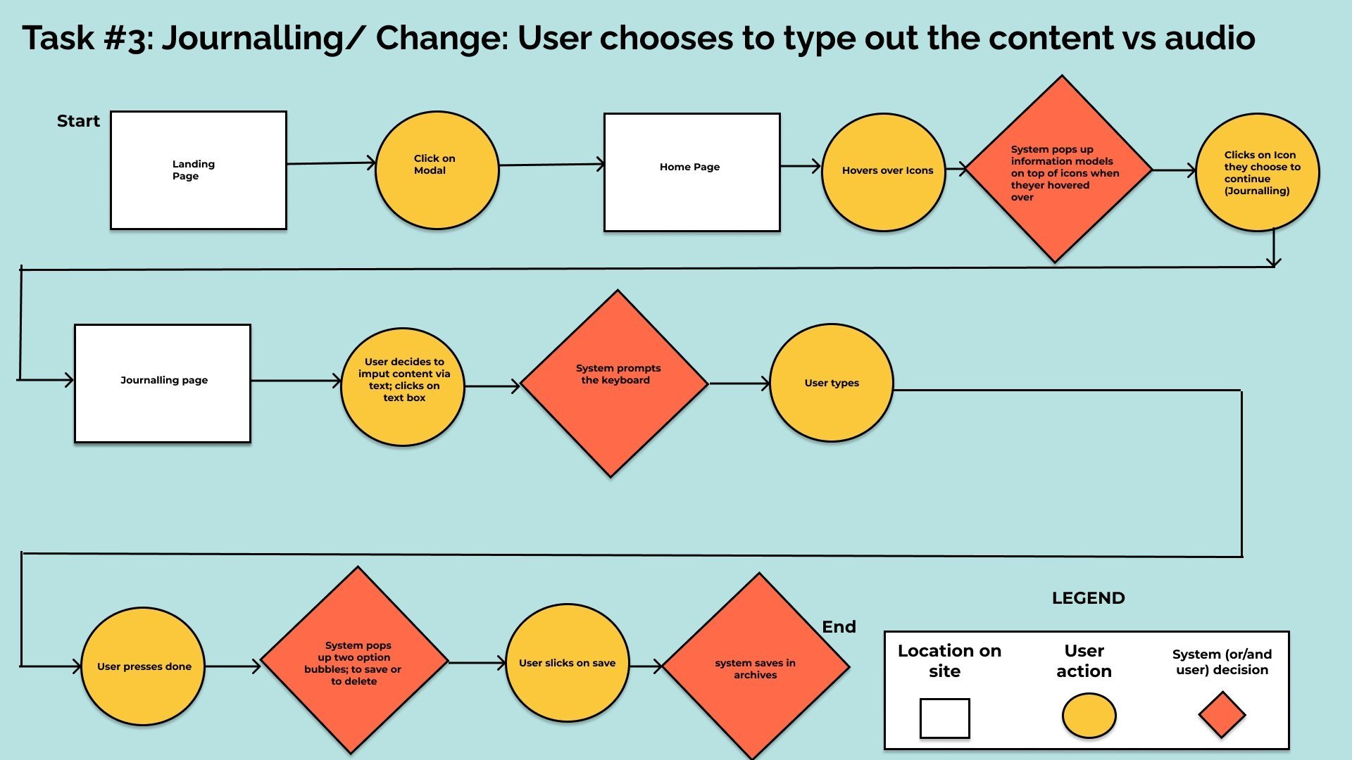
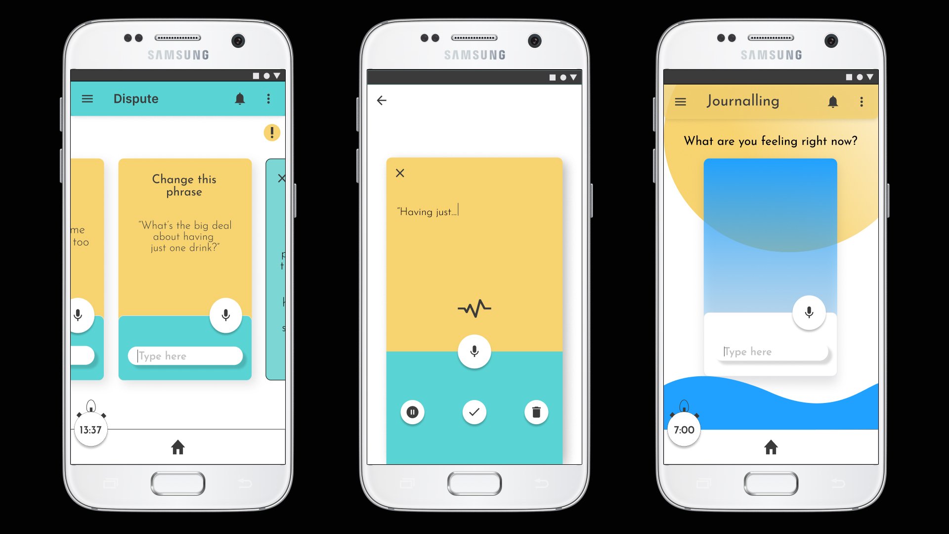
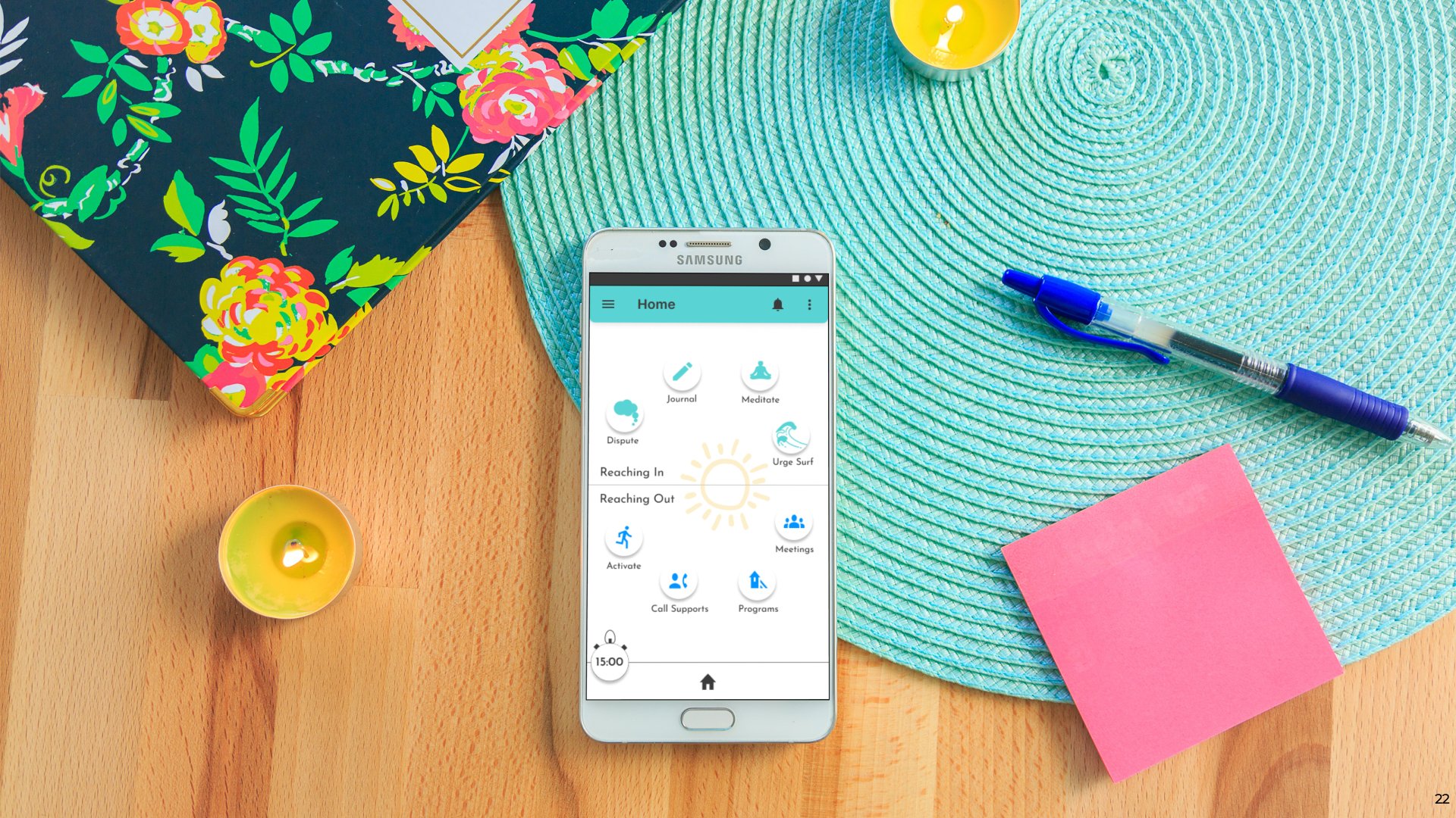
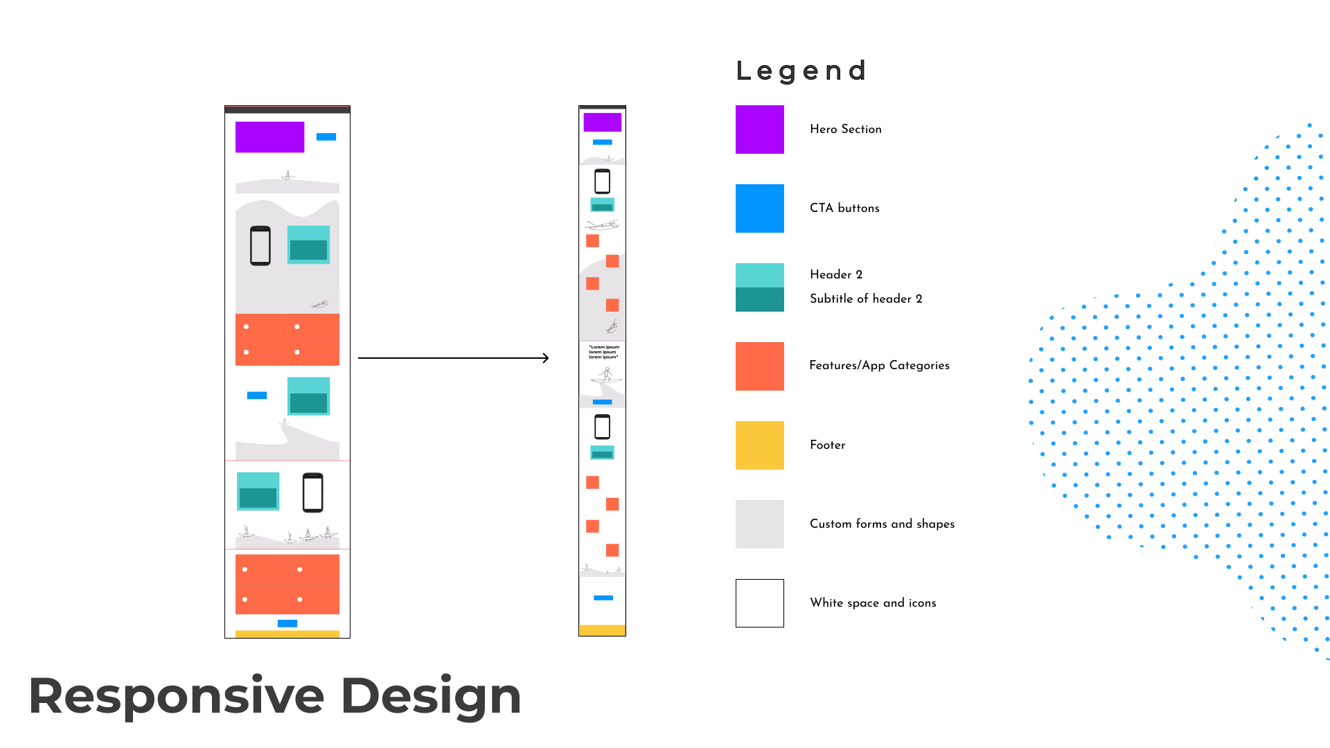
Sketches
All of the findings and insights form first, on paper and then, on the Art boards of a digital design software called Figma
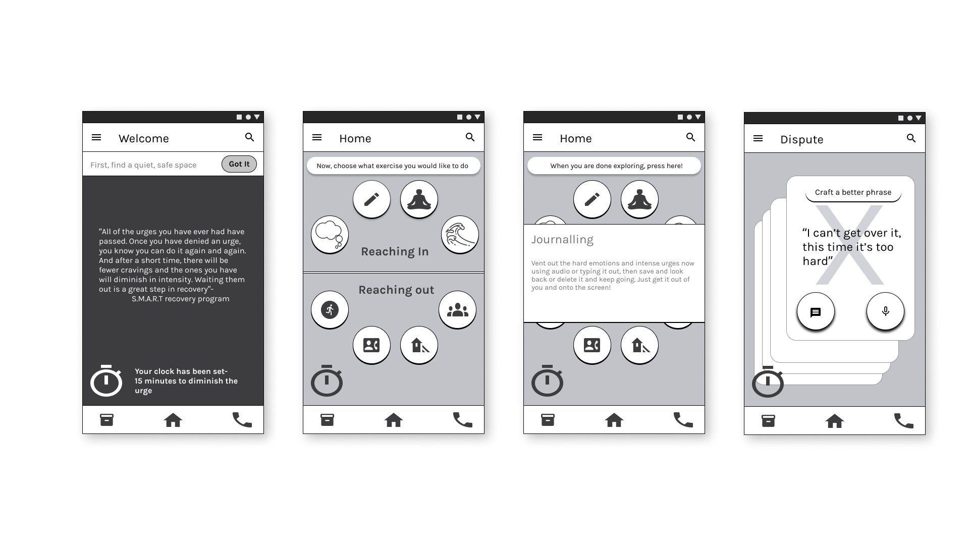
After I tested the sketches on users using the Marvel Pop App, I started creating the wireframes
I collected User Interface artifacts from other sites , gathering inspiration in the form of a UI Inspiration board in InVision
I looked into how to structure every element, making sure to constantly revert back to Material Design Guidelines for structure.
I chose an Android mobile as my Art board in Figma @ 360px x 640px
4.Wireframes
User Testing and Iterations
3 rounds
15 participants
I chose participants for my user tests using certain criteria
Canadian
In Recovery (preferably early) from drugs and/or alcohol
5.Visual Design
Visual Study
Moodboard
First iteration. Right from the beginning, I harboured a vision of a dark pallet with neon colours, highlights emphasizing light through the crack of a door.
Typography
First iteration. At first, I was attracted to the permanent marker type above and when I started creating the cards with colour, I used this typography for the journalling input.
Final Version
Learning from my design critique guided me to a totally different design
Light, Welcoming, Warmth, Hope
How would they want to feel when they opened the app? These are the sort of questions I asked myself moving forward with the visual design
UI Inspiration
I found so much inspiration from Google and Dribble
6.High-Fidelity Prototype
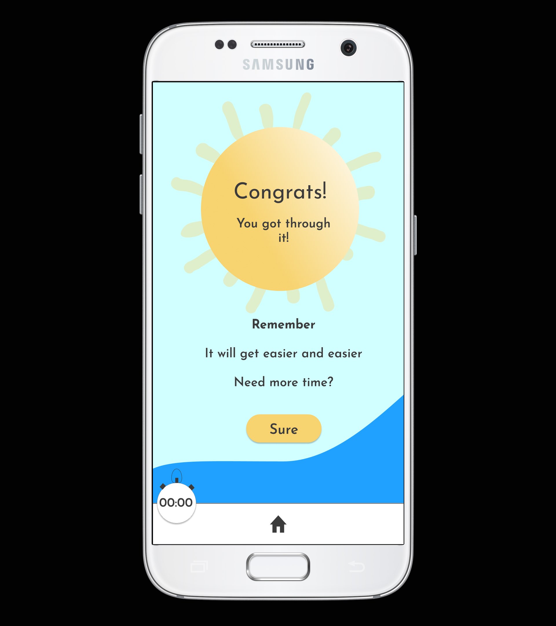
Check out the mobile prototype
7.Development and Future
Imagine…
the radical idea of normalizing sobriety. Sobriety for Anybody. Let’s try to make it less intimidating and let’s try to connect people right away with the resources they need to succeed
Voice-Only Interaction study
Once I was done the app prototype and marketing site, I pondered what other platform the services could function with. Using automatic speech recognition and active learning software, our target user can complete the 4 coping exercises using a voice-only interaction. The voice software would be conversational, adaptable and relatable. This option would increase accessibility- providing an alternate option to typing or a screen-based interaction
Click on the image for a larger view
More Projects
Troopfinder
We discovered a need to help new business owners discover and explain what they needed to digitize their product. RFP is the new MVP
ProPEGate
Customer surveys revealed a new way to expand their customer base as we crafted their Instagram business to an e-commerce website


